
Baseline grids
Type aligns to a 4dp baseline grid. See detailed information on typography.
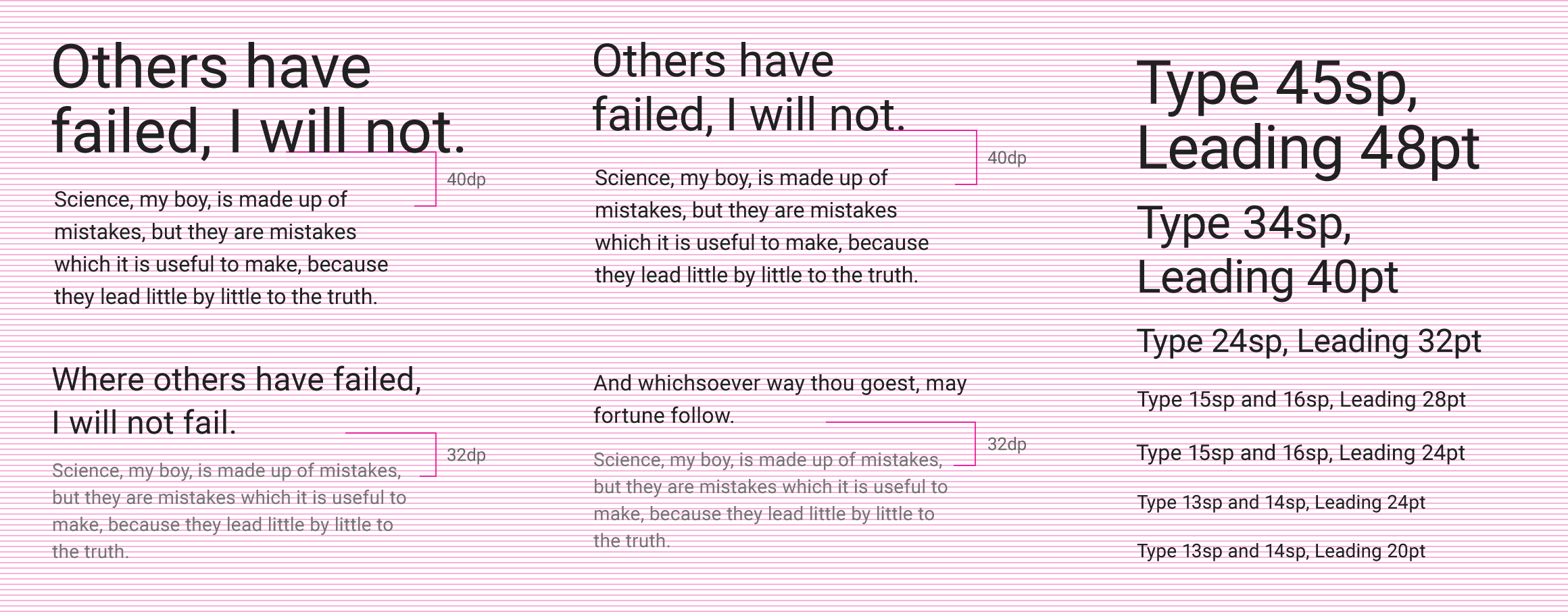
Example of typography in a baseline grid
Keylines and spacing
The following templates and examples contain keylines, spacing guidance, and sample screens for elements on mobile, tablet, and desktop.
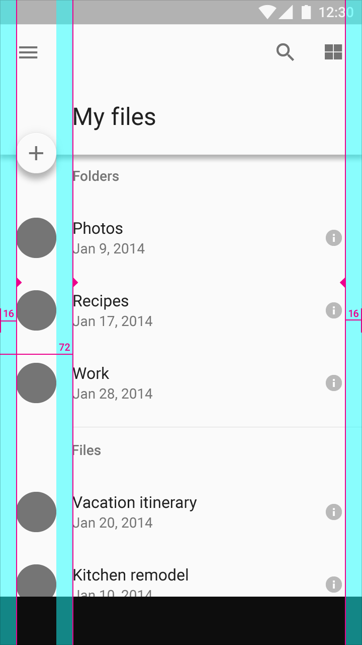
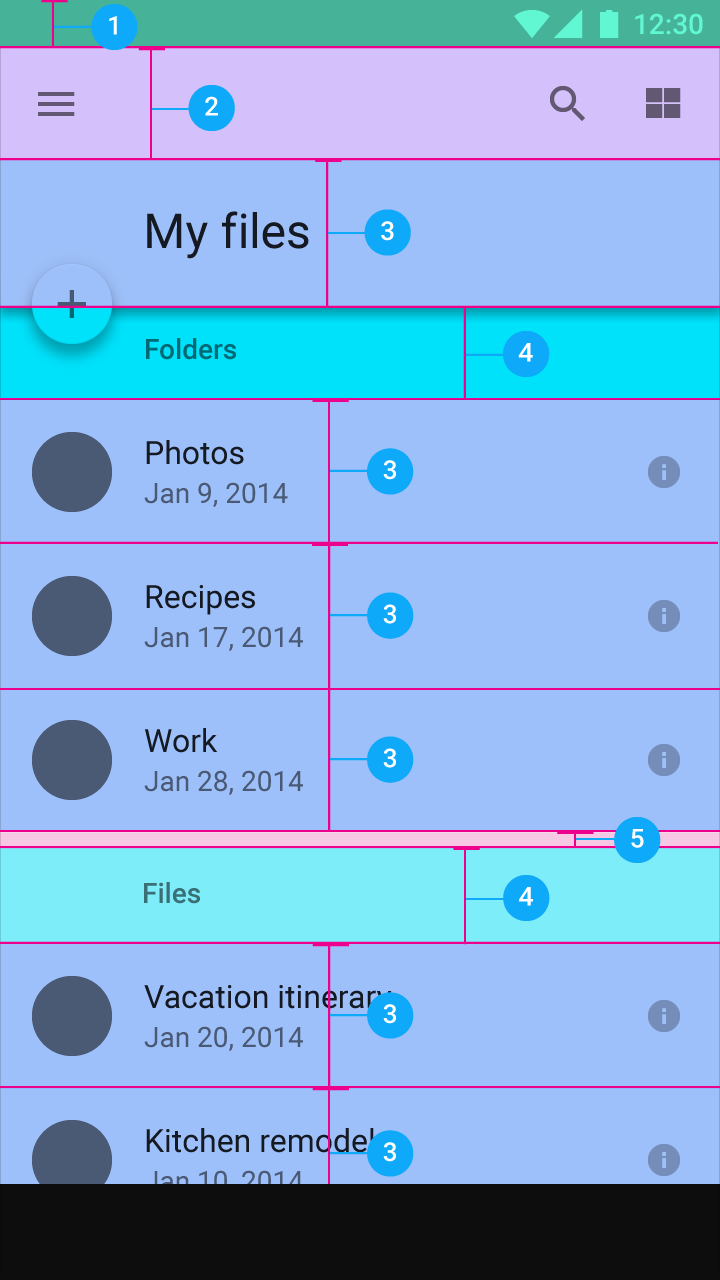
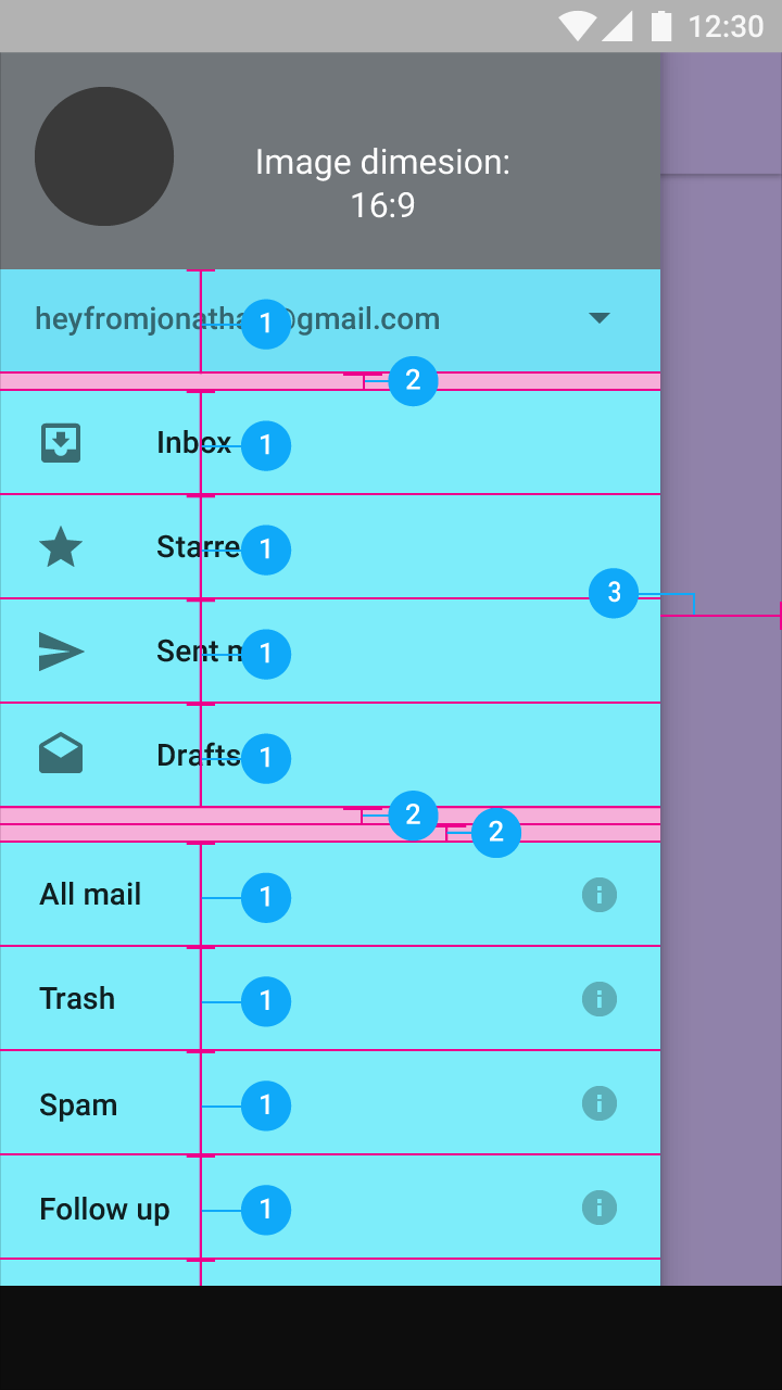
Mobile
List
A two-column, left-aligned list with a 56dp floating action button.

Keylines and margins
Screen edge left and right margins: 16dp
Content associated with an icon or avatar left margin: 72dp
Horizontal margins on mobile: 16dp.

Vertical spacing
- 1. Status bar: 24dp
- 2. Toolbar: 56dp
- 3. Subtitle: 48dp
- 4. List item: 72dp
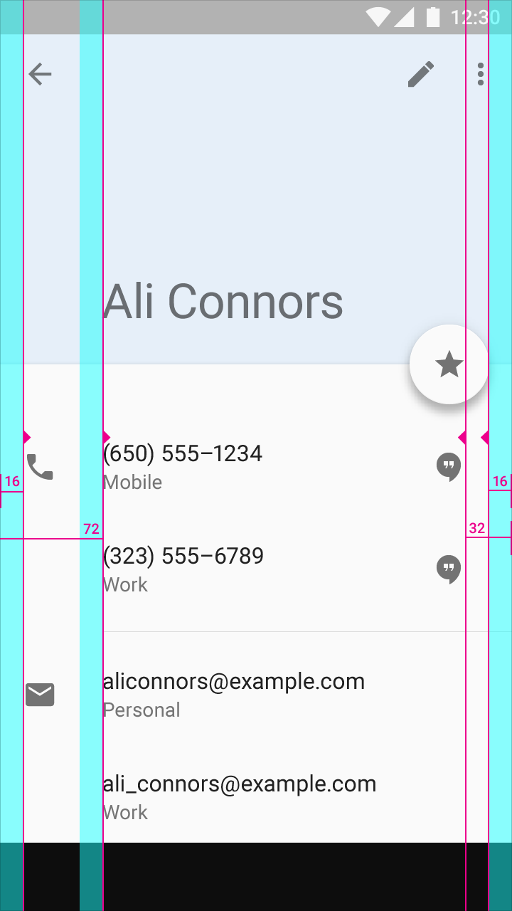
Keylines and margins
Screen edge left and right margins: 16dp
Content left margin from screen edge: 72dp
Vertical spacing
- 1. Status bar: 24dp
- 2. Toolbar: 56dp
- 3. Title and list items: 72dp
- 4. Subtitle: 48dp
- 5. Space between content areas: 8dp
Detail view
A detail card with a 56dp floating action button.
Keylines and margins
Screen edge left and right margins: 16dp
Content left margin from screen edge: 72dp
Right-side icons align 32dp from the right edge to coordinate with the floating action button.
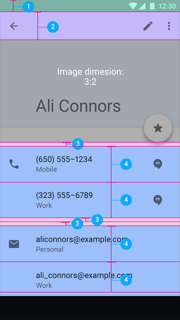
Vertical spacing
- 1. Status bar: 24dp
- 2. Toolbar: 56dp
- 3. Space between content areas: 8dp
- 4. List item: 72dp
Navigation drawer
A side navigation menu with icons, avatars, and text aligned on the left. Other icons align on the right.
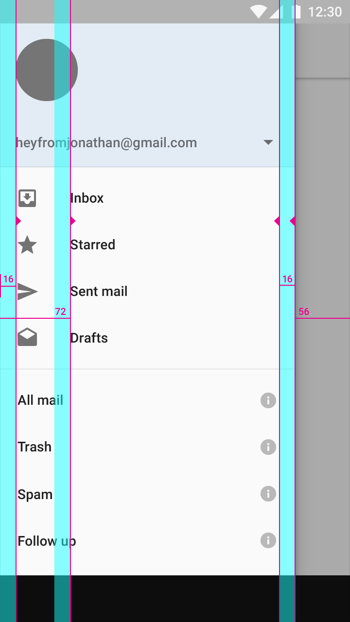
Keylines and margins
Screen edge left and right margins: 16dp
Content associated with an icon or avatar left margin: 72dp
Side nav width: The screen width minus the height of the action bar. Here, the width is 56dp from the right screen edge.
Vertical spacing
- 1. Account menu and list items: 48dp
- 2. Space between content areas: 8dp
- 3. Navigation right margin: 56dp
About Brief Material Design Layout – Metrics & keylines for Android Mobile
Mockups can help the user to get a quick impression of your future website and they do not
have to wait for final screen to review and validate the idea which can bring the loopholes
forward and save your money and your nerves. Introducing you the brief material design which
is not just for web designers but the user can also use for analyzing the functionality.
Our material design layout which probably the best ensures mockup matches all your design
practices at best, it’s specialty is, it includes Metrics & key lines for Android Mobile with the
powerful function that you never have to master any expertise of coding or programming before
incorporating it. Moreover, Mock plus is undoubtfully easy for everyone to create page design
mockups less than the time it takes to blink eye. Freely download our fully customizable mockup
with minimalistic icons which is suitable for every need.
PSD Name:Material Design Layout – Metrics & keylines for Android Mobile
PSD Description:Material Design Layout – Metrics & keylines for Android Mobile
PSD: Material Design Layout – Metrics & keylines for Android Mobile
Designed by: PsdGang
Design: 1.0
PSD ID: SKU: Material Design Layout – Metrics & keylines for Android Mobile
Price: 0.00 New
Size: 2.57 MB