3. Buttons
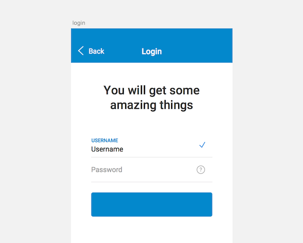
To make this form usable we have to add the login button and sign up link. To do so press R, drag a rectangle and name your layer button login with the following property values, including some border radius:
X : 80
Y : 646
Width : 480
Height : 96
Radius : 8
Fills : H200, S100, B80
Borders : unchecked
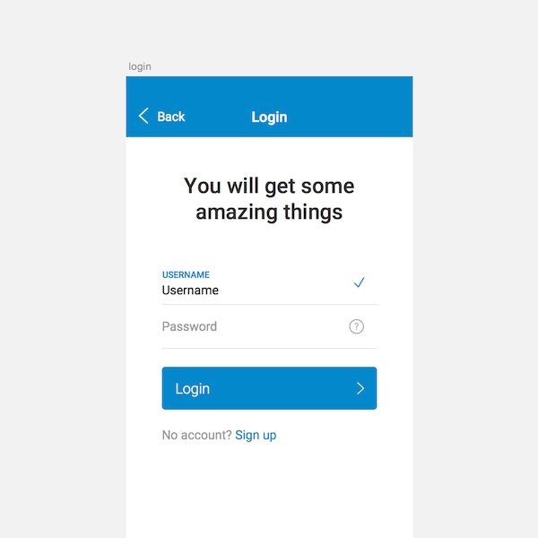
Now let’s add the text. Hit T then write “Login” with these properties:
X : 110
Y : 676
Typeface : Roboto
Weight : Light
Color : White
Size : 32
Line : 32
Finally we’ll add our icon by clicking Insert > Symbols > right icon then positioning it like so:
X : 517
Y : 682
Group your last three layers and name it Button login. You should get something like this:
Sign Up Link
Now let’s add our “sign up” link. To do so hit T and enter “No account? Sign up”. Give this text the following properties:
X : 80
Y : 784
Typeface : Roboto
Weight : Regular
Size : 28
Line : 28
Finally we want to make the link itself stand out from the rest of the text. To do so select your text layer and change the color to: H0 S0 B60. Select only the “Sign up” part of the text string and apply your main color (in my case H200, S100, B80).
Congratulations!
Congratulations we are done with the login form! You now have everything you need to design a simple login page for your application, inspired by Material Design aesthetics.
As an extra challenge, why not help your users by adding some social login features? Download the final file to check (as a bonus) the sign up, lost password and congratulations modals.
Thank you for reading the tutorial. Don’t hesitate to ask any questions in the comments below.
source: www.webdesign.tutsplus.com
23,906 total views, 9 views today


